Youtuber Client work.

Recently I was given Client work from a gaming group that goes by the name “Outbreak gaming” The channel admin who goes by the alias “CombatMedic02” came to me and asked if I was able to create him an animated watermark for his channel.

He gave me a small list of things he wanted to be featured in the watermark.

– Must contain deference to our logo (biohazard sign)
– Must contain the name
– Must be very simple

He then gave me a references to how he imagined it to look.

https://i0.wp.com/ak.picdn.net/shutterstock/videos/925312/preview/stock-footage-computer-rendered-animation-for-geography-or-news-tv-channel-with-golden-terrestrial-globe.jpg

It was quite broad so I had a lot of comfort when crating the watermark.

I created a few simple sketches, mostly to see how it could work

icon as

I handed the first batch of designs to my client as we actively spoke and he very much fell in love with the final two designs and said if I could merge the two together.

The final design was created and sent to my client who thought it would be perfect!

My client sent me an attempt he did and asked me to use it if it helped, he also asked if I could fix the lighting for him.

Bellow is my attempt at fixing what he tried, however I just couldn’t get the lighting correct, there wasn’t enough frames to make it fluid and it was simply just too fast, also animating the text around this gif was just too hard. So I scrapped it.


BLUEe

So I decided to make the animation in 3ds max and here is what I got.

Logo

When making the model in 3DSmax I found it was much easier then having to do frame by frame like I was in Photoshop. Not only that but i noticed I had much more freedom to try different angles and show to my client.

Once I was happy I sent it to my client who asked for a full front view, animating it as suggested in my sketches.

Animating it, this is what I came up with.

Outbreak0000

I gave it to my client however he didn’t like the colors and neither did he like how the text and sign wasn’t continues, so I had to go back to the drawing board and created this gif instead.

Watermark V3

Sending it to my client he was very happy with it and began using it on his video!

There was a lot of tweaking and testing involved during the making  of the final piece and bellow is a video of myself and my client testing and trying different things until we both where happy.

and bellow is him using the watermark on one of his latest videos


A personal concept project

Concept design is something Im very interested in and its the area I very much wish to get into, so I thought a personal short deadline based concept project should do me the world of good. Allowing me to create concept’s from a mini brief I created and with holding myself to only 2 weeks to come up with initial concepts and a final piece in 2 weeks should allow me to start teaching myself to keep to deadlines much more as I feel I lack this and making personal deadlines will really allow me to stay focused.

So here it is!

Mini brief:

Due in: 2 weeks

Focusing on: vehicles

Art style: realistic

Type of vehicle: Cargo / transport vehicles

Period in time: Future / present (Down to earth to the 20th century)

The use of the Vehicles: Alien Invasion

Im being strict on myself and in two weeks I wish to produce a final and quality piece.

Year 2 Client Project: Whitefriargate, Hull

During the first week of returning to collage, we received our client project which was to be a 1960’s Whitefriargate, Hull. We was to work with a Client to create an immersive environment of Whitefriargate and some of the streets around that area like Silver St, Land of green ginger and so on.

This project would be a large group project with each student participating in the project in one way or another. As a group the first thing we had to do was to decide when we was going to be basing our research on and on what specific event at the time. I quickly mentioned 1969 as 1969 was during the time of the moon landing. However we decided not to base it on 1969 due to a lack of interest and instead decided to base our project on 1966 which was during the world cup finals where England beat Germany 4 – 2. This was an exciting time for England and we thought this event would create a joyful vibe within our game as well as allow us to explore with the environment and also allow us to add many aspects of vertical to our game with banners and balloons all celebrating the world cup.

At the end of the session we all suggested that we all did research on Whitefriargate, hull in the general time period of the 60’s but mainly focusing on 66 if we can. General research would be gathered using the internet, books, archives and so on.

The week after we all decided we needed primary photographs to allow us to capture the general feel of scale, to capture detail like Engravings and such and finally photographs down each street to show what could be seen past the end of each of them. These would be our primary picture reference of all of the buildings around Whitefriargate, Land of green ginger, Parliament St and so on. We split up into groups of 2’s and had a coloured street map which had multiple colours highlighting all the different sections each individual group had to take photographs of. This made taking the photos much easier.

Once we was finished we headed back to the studio where we handed in the photographs to Phil Maclennan and Jason pook who then placed them all into one large research folder on the computer. Upon discussion we realized that we would have to think about how we would block the player from getting anywhere we didn’t want them too.

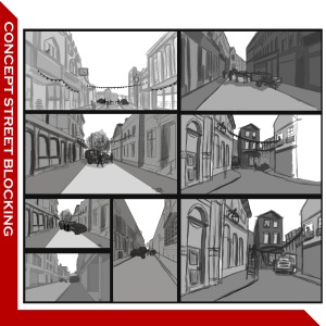
Some of us was then tasked to create concepts for blocking the areas. I created several different concept blocking ideas as you can see bellow.

whatever

Once we created a large amount of concepts of how we where going to block the streets, as a group we then decided what would be best and altered the concepts as we reviewed them. Once we finally decided it was then briefly placed into the gray blocking of the map.


A wild concept artist appears!

Upon heading to my class I received a message over twitter asking if I knew any decent pixel artists. Searching for the designers names for the metal slug series I stumbled upon a man names Simon M Hunter who started off in 1988 as a comic artist for a small monthly magazine, soon after in 1992 – 1993 Simon M Hunter produced a 2000AD Judge dread comic before finally becoming a 8-bit games lead artist from 2004 – 2007 but now January 2014 – March 2014 he works with GAMELOFT as a Research and Development Art director. I Highly recommend looking at his Concept gallery as he works in a rather wide verity of digital media being pixel, Vector, and character design.

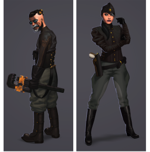
both characters4ymonsterman44 copyremixed explodemon 11

I highly recommend you Click the link bellow to see Simon H Hunter work if what you see catches your interest!

[Link to Simon M Hunters Site]


Photoshop Tutorials by Scott Robertson

Searching through YouTube for some Colouring and concept tutorials I can use for my work, I stumbled upon a guy named Scott Robertson [Youtube channal link here] Searching through his videos I was able to learn his art style and adapt his techniques to my own style .

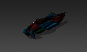
consept ship

This was the first picture I drew using his style and his shading techniques he showed in his videos. From previous pictures Iv realized how much more effective this method was for creating form and allowing shadows and light to create the structure of the craft or building etc!Another tip was, if their is a glass object some where, place some thing behind it! this allows the viewer to quickly realize some thing is made of glass, and if its a canopy for a craft, it allows you to set scale also.

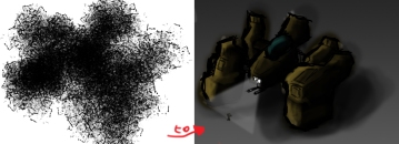
Moving ahead I decided to make a second drawing using paradolia from a simple scribble, using a tool which creates crack like textures, this allowed me to have rather fun shapes to play with and allow me to shape out things I could see.

Paradolia

So as you can see on the left side of this picture was the scribble and the right was the finished piece. I used what I knew from my own techniques and adapted them to what I learned from Scott Robertson videos.

Step by step

Here as you can see from the picture is the step by step procedure I took from the Scribble to final drawing.

As you can see I shaped out the shapes I could see from the scribble, to then shape out value to the machine by adding light and dark tones to the shapes, this allowed the image to seem more 3D, once that was done I added detail to then finally the last bits of detail to add character to the machine.

Seeing Scott Robertson videos was a nice learning curve to further advance my drawing skills to a whole new way and will allow me in future create multiple charicter designs much more quickly in such a short ammount of time!

Give Scott Robertson videos a look and see what you can get out of them!

16 – bit Forest concept

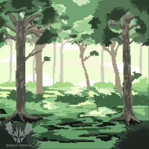
For one of our assignments we where given the task to come up with a video game idea but using an existing story concept so in my case “little red riding hood” though it would be set in a fantasy land where the big bad wolf has an army and has captured little red riding hood and you like a standard Final fantasy type RPG game but with a Mario type “world 1-1” type thing and in 16-bit… anyway here we have just 1 part of my concept scene, here’s a possible battle scene you would have while in a forest zone.

16 bit forest

So here is the finished product, could of done with a bit more detail maybe? I could of spent more time on the actual trees I suppose, however its still got the 16-bit charm!

Tree3

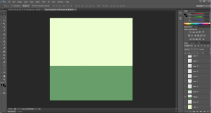
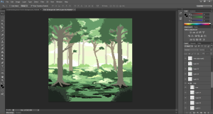
Here you have me using layers, applying 2 base colors, a standard green colour and a slight cream colour as a base.

Tree

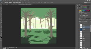
I shaped out simple bush’s, trees and over head trees to give me a base of where things could go.

Tree2

Once happy with the result I added details , shading etc to some of the main parts to shape out the trees more and add more character to my work.

I decided however to not place that much detail on the trees in the distant due to how in real life when looking at an object from afar the object would contain less detail. I wanted to slightly exaggerate that by only making the trees closest have details and I believe this created a nice effect!.

I also added a white grid across the top down with a fade from top to bottom to create a fog-like effect, I considered this very effective and I might consider doing this again for other pieces.

In this piece of work I also managed to experiment with arranging my layers accordingly as well as naming some of the layers into files so I didn’t get confused on which layer associated with work.

16 bit forest

Thus we have the final concept piece with the detail in place.